Best Practices for Accessible Form Design
When creating a dashboard form, it is a good idea for DataBlock Designers to consider accessibility in their design. Planning for accessibility will result in your DataBlocks being easier to use for people who rely on screen readers, keyboard navigation, or other forms of assistive technology to access Argos.
There are several considerations for developing accessible content:
Form Layout
- Most screen readers read documents linearly, from top to bottom, left to right. Group logical information so that it will be read in an intelligent order, rather than relying on the visual presentation to convey meaning.
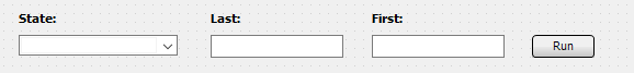
- Consider placing labels above or to the left of objects, instead of underneath or to the right. The Labeled By property can also help with this for certain object types.
- Buttons that perform actions based on entered parameters should appear after (below and/or to the right of) the parameter fields. This allows users to enter parameters and then tab to the button, instead of forcing them to jump back to the top of the page to proceed.
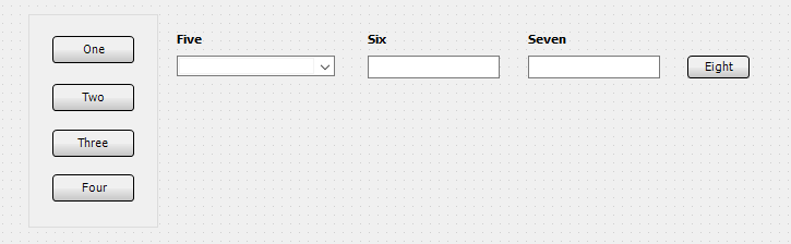
- Objects that are grouped together on a panel will cause the focus to move through each item on the panel before resuming the top down, left to right order on the rest of the dashboard. Panels can be used to construct vertical menus or other layouts where you want the focus to move down before moving to the right.
- You may use the Initial Focus form property to specify the object that should receive focus when a form loads. If not specified, the first item in the focus order defaults to the most upper-left object on the form. If you specify an Initial Focus object, it should make sense to users, especially screen reader users who may be unaware of content that appears before the Initial Focus object.
- Use titles or headings for sections or at the top of forms so that users know what they are looking at.
Controlling the Tab Order
The best way to achieve a tab order that makes sense is to position tabbable form objects (buttons, dropdowns, date and edit fields, list and memo boxes, radio buttons, and checkboxes) in the desired order, and make sure objects are aligned accurately. The tab order is calculated based on each object's upper left corner, so to have it move in a horizontal row each object in that row will need to be aligned vertically.
Initial Focus
You can choose which object on the form should receive focus when the form loads by specifying the Initial Focus form property.
Object Grouping
In some cases you may wish to have the tab order move through a certain group of objects before continuing on. To achieve this, you can add the objects to a panel. The tab order will move through each item on the panel before going to the next object.
Button and Link Text
- Screen reader users may not be able to understand the purpose of a button or link when it is taken out of context of the visual presentation or surrounding text. When tabbing to a button or link, any previous text content is skipped. A good solution for this is to use descriptive text for the button or link. For example, instead of labeling your button "Go", you might call it "Retrieve Data". For a hyperlink, this could say "Launch Google" instead of "click here".
Choice of Objects
- Use objects for their intended purpose whenever possible. For example, if you want a button, use a button object instead of a shape with a label on it. Buttons are keyboard-accessible, whereas shapes with labels are not.
Color and Contrast
- Choose appropriate colors with a contrast ratio of at least 4.5:1 for normal sized text. Large-scale text (generally considered 18pt or higher) can have a contrast ratio of 3:1. Use a free contrast checker such as Colour Contrast Analyser to ensure that you have chosen readable colors.
- Do not rely on color as the sole means of conveying information.
Object Properties Affecting Accessibility
Most Argos objects have properties than can be used to improve accessibility. Where provided, you should use these properties to ensure the best experience possible for your users.
Accessible Text
Some form objects have an Accessible Text property, which can be used to provide a text alternative to objects that contain visual information, such as images, charts, OLAP cubes, and shapes. It also works with edit boxes and list/multi-column list boxes. When a screen reader user navigates the dashboard in the Web Viewer, this text is read to the user, helping them to identify the content if they are unable to see it.
This property is currently only supported in the Web Viewer, and does not have any effect when using a screen reader in the Argos client (may be added in a future release). As a best practice, you should always fill this field out where it makes sense to do so. This ensures the best possible experience for users who rely on assistive technology to navigate Argos.
Labeled By
The Labeled By property is a drop-down field that allows you to choose an existing text object on the dashboard to assign as the label for this object. When using a screen reader in the Web Viewer, the selected text label will be read to the user when they navigate to the object. When designing a DataBlock with accessibility in mind, it is a best practice to assign labels for all form input fields, particularly edit boxes, date edits, and drop-down controls. This property can also be used with checkbox and radio button groups, list and multi-column list boxes (note: does not work with list boxes using JAWS/IE), and memo fields.
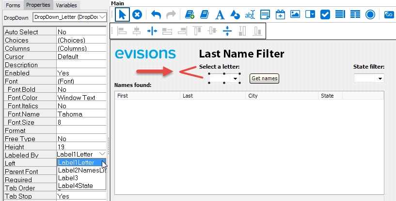
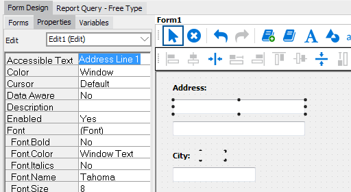
In the example above, the variable name of the label with text "Select a letter" label is Label1Letter. To associate it with the dropdown that the label is describing, select the dropdown field and then set the Labeled By property to the variable Label1Letter.
Note: Most edit boxes should use the Labeled By property to associate the edit box with its visible label. In the case of edit boxes that do not have a text label, or that require more specific information than the label includes in order to communicate something that is obvious visually, you can use Accessible Text to provide this. A good example is a set of two fields intended for entering different lines of an address. A sighted user can see that the "Address" text label belongs to both fields, but a screen reader user would benefit from having a label on each field since they are unable to see the grouping visually.
This property is currently only supported in the Web Viewer, and does not have any effect when using a screen reader in the Argos client (may be added in a future release).
Tab Stop
The Tab Stop property was removed in Argos 6.2. In version 6.2 and higher, objects that can be interacted with are always included in the tab order. In earlier versions, DataBlock Designers had to manually set the Tab Stop property to Yes for objects that users should be able to get to using the keyboard, such as form fields, buttons, and list boxes. If Tab Stop was set to No for an interactive object, keyboard users were unable to access it, potentially preventing them from using the DataBlock. Upon upgrading to version 6.2, all interactive fields will automatically become tabbable.
Tab Order
The Tab Order property was removed in Argos 6.4. In earlier versions, this property controlled the navigation order when using the keyboard to tab through dashboard objects. DataBlock Designers no longer have to manually specify the tab order. Instead, Argos handles this for you. The tab order is always left to right, top down. Note that in the case of objects that are grouped together on a panel, the tab order will move through each item on the panel before going to the next object.
Form Properties Affecting Accessibility
Initial Focus
The Initial Focus property specifies the object that should receive focus when the form loads. If not set, the first item in the focus order defaults to the most upper-left object on the form. Only dashboard objects that can receive focus (buttons, dropdowns, date and edit fields, list and memo boxes, radio buttons, and checkboxes) are available to set as the Initial Focus object.
We will be including additional accessibility-related enhancements in future releases of Argos. If you have any questions, comments, or feedback on these features or would like to see a specific feature added or prioritized, please let us know.