Charting
Charting is one of four modules that can be added to Argos. To check if your institution is licensed for the Interactive Charting module, a MAPS administrator can go to the License screen in MAPS Config and select Argos. If you are not licensed for the this module, you will see a message to this effect when attempting to create a chart in Argos.
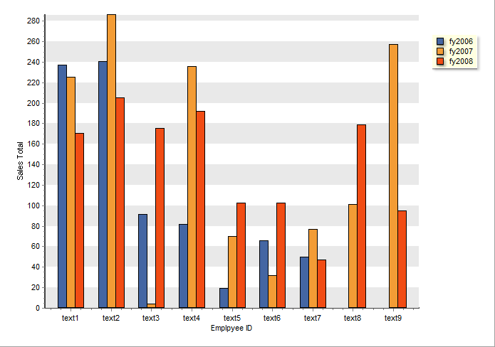
Charts (bar, line, pie, etc.) displaying multiple series of data can be created in both dashboards and banded reports. The bar chart below shows the use of multiple series of data. Each of the three datasets contains information for a fiscal year.
In addition to the Help pages which describe charting, a step-by-step tutorial demonstrating the use of the wizard to create the chart above exists in the Argos DataBlock Designer Guide (Example 5 - Charting with multiple series). A more simplified example exists in the Argos Report Writer Guide (Example 11 - Creating a Chart).