Interactive Charts on Argos Dashboards
Adding interactive charts to your Argos dashboards is an excellent way to display a lot of data in an easy-to-digest format. It allows users to start by viewing the data at a very high level and then work their way down into the granular details.
Example Dashboards: Accounts Receivable
Before we get into the step-by-step, we’re going to walk through the Accounts Receivable Dashboard, which is available for download on the CO-OP user community. It’s a great example of how much value you can get from working with interactive charts.
The top level starts with a pie chart showing transactions according to their aging periods.
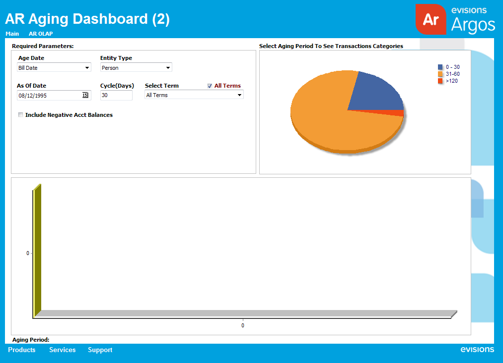
When a user clicks on a pie slice, the bar graph will display data for that aging period, organized by category.
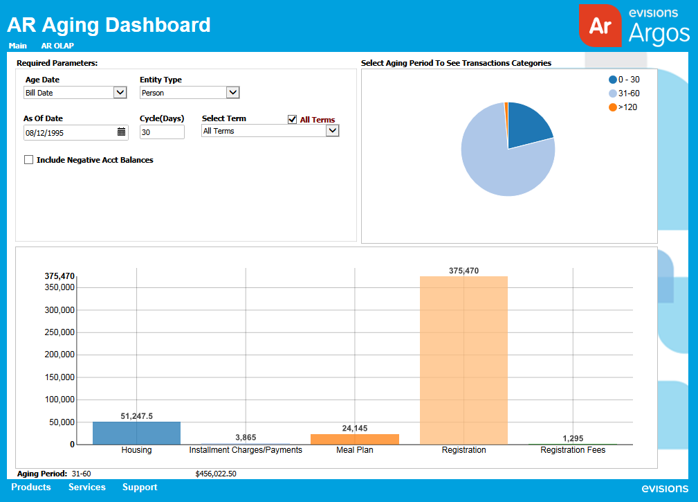
For even more detail, users can click one of the bars to see a list of students who have transactions in that category.
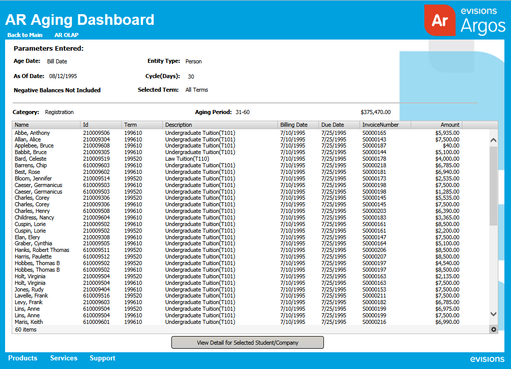
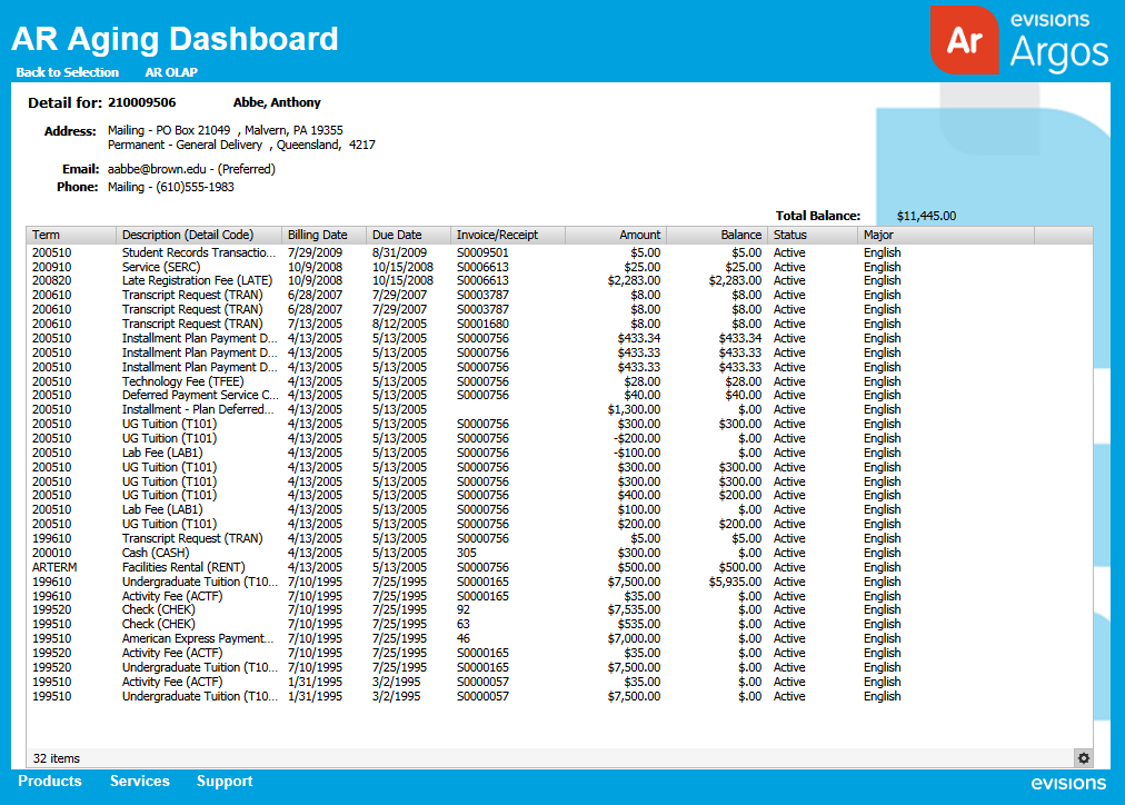
Finally, by selecting an individual student from the list and clicking the ‘View Detail for Selected Student/Company’ button, the user can drill down to see the student’s transactions in that period and category.
Adding Interactive Charts to Your Dashboards
Now, there are many ways to navigate between forms in a dashboard. But as we saw in the example above, using charts to drill down into more specific detail can be a powerful method to visually display your institution’s data. Below, we’ll walk you through the steps you would need to take to create your own interactive charts.
Key Concepts
Creating interactive charts relies on a couple of key concepts:
- Using Charts as Parameters – Like most other objects in Argos, charts can be used as parameters in your queries. You can use a chart in the same fashion as you would any other control object to determine what information is displayed in a multi-column list box or banded report. They can be accessed in query design by finding them in the list of user-defined variables. By referencing the higher-level charts as parameters for each subsequent level of detail, you’ll be setting up the drill down hierarchy.
- Configuring On-Click Events – On-click events are actions that occur automatically when a user clicks on an object. There are a variety of actions that you can specify for an on-click event, but the one we’re going to be dealing with in this exercise is the ‘Activate Form’ event. By adding an ‘Activate Form’ on-click event to our dashboard objects, we can create the drill down navigation we’re after.
Note: You can configure on-click events for many different kinds of objects in Argos, from charts and graphs to buttons and images.
Step One: Create Forms and Chart Objects
Your first project is going to be to create all of the forms and chart objects between which we’ll be navigating. To create a dashboard of a similar format to the one in our example, you’ll need the following:
- Main Form – This form will have the first two levels of your data. It should have control objects for defining your dataset, as well as a pie chart by time period (highest level of detail) and a bar graph by category (second level of detail).
- Category Detail Form – This form should have a multi-column list box that displays all of the individuals that have transactions for a selected category (third level of detail). It should also have a ‘View Detail for Selected Individual’ button at the bottom of the form.
- Individual Detail Form – This form should have a multi-column list box that displays all of the transactions for a selected individual (fourth level of detail).
When you’re building the charts, graphs and multi-column list boxes, each of them will need to refer back to the previous object in the hierarchy. So, for the bar graph, you’ll need to use the selected time period on the pie chart as a parameter; for the Category Detail multi-column list box, you’ll need to use to the selected category on the bar graph as a parameter; and for the Individual Detail multi-column list box, you’ll need to use the selected individual on the Category Detail multi-column list box as a parameter.
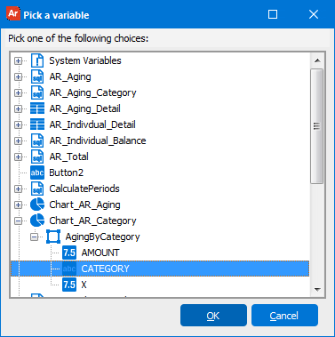
For reference, when you go into the user-defined variable list (by clicking the ![]() button in the query editor), you’ll see a list of all of the variables you’ve defined so far. Simply find the chart, graph or multi-column list box you want to reference, and then select the specific value you want to use.
button in the query editor), you’ll see a list of all of the variables you’ve defined so far. Simply find the chart, graph or multi-column list box you want to reference, and then select the specific value you want to use.
Below you’ll see an example of the selecting the category from the bar graph from our Accounts Receivable example dashboard.
In your query, the chart variable will end up looking something like the following AND statement:
and TTVDCAT.TTVDCAT_DESC = :Chart_AR_Category.AgingByCategory.CATEGORY
Step Two: Create Drill Down Navigation
Once you have all of your forms and objects set up and functioning correctly, it’s time to add the drill-down navigation. Since the first two levels of detail—the pie chart and the bar graph—are on the same form, you don’t need to add an on-click event for them. The bar graph will automatically populate as soon as the user selects a slice of the piece chart.
For the next two levels of the drill down, though, you’ll need to configure on-click events:
- Bar graph > Category Detail Form
- ‘View Detail for Selected Individual’ button > Individual Detail Form
To add the first on-click event:
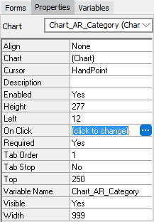
- Select the bar graph.
- On the Properties tab, find the On Click row, and click in the right-hand column.
- A button with an ellipsis will appear. Click on it to open the Edit Event window.
- From the Available Events list, double-click ‘Activate Form’ to add it to the Event list.
- Beneath the Event Properties heading, you’ll see a pull down menu called Form Name appear.
- Select ‘Category Detail’ from the Form Name pull down.
- Click the OK button to close out of the window.
- Click the Test button to make sure that, when you click on one of the bars in the bar graph, you’re taken to the Category Detail form.
Follow the same steps to add an on-click event to the ‘View Detail for Selected Individual’ button to take you to the Individual Detail form.
You now have a powerful dashboard with interactive charts that put a huge amount of data at your end users’ fingertips.