Sample OLAP Cube
In the following example, the gender and age range dimensions were dragged into the Dimension Row Toolbar; the calendar year dimension was dragged into the Dimension Column Toolbar.
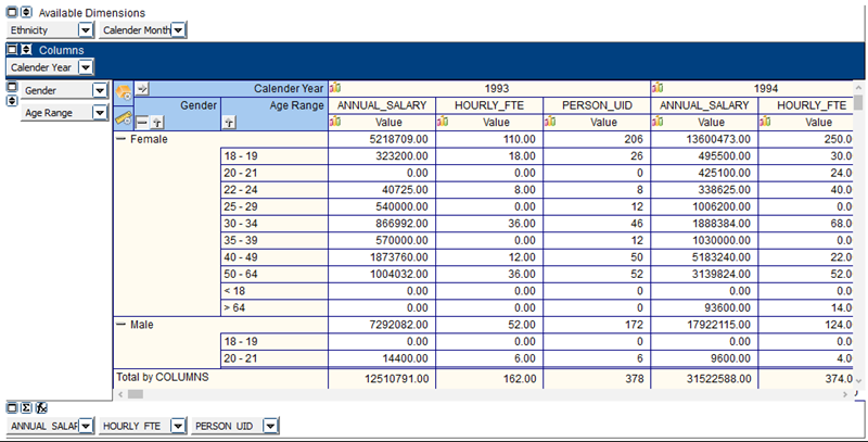
The user has complete control over what is displayed and how it is displayed. Experiment by moving dimensions into rows or columns in order to produce the desired report format.
Right-clicking anywhere within the cube will bring up a menu which allows you to export the cube to your installed spreadsheet application and automatically launch it.
Charts
In the above cube, note the chart icon on the Column Dimensions. If you click, the user will have access to different charts. In this example the chart icon was clicked in the Annual_Salary column.
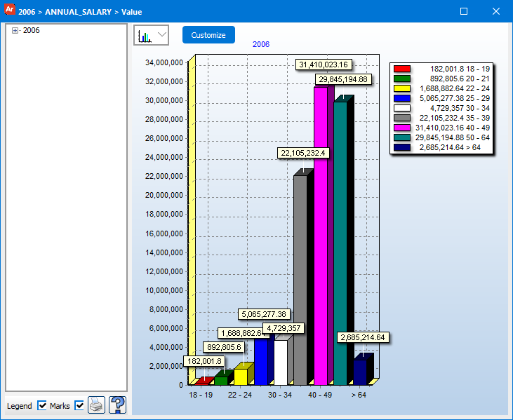
Chart Options
The end user can change the style of the chart by clicking the drop down list displayed above the chart.
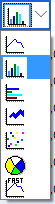
The user has seven predefined styles to select. In addition, other properties of the chart can be modified by clicking the ‘customize’ button. This brings up the same interface as found in the Band Editor:
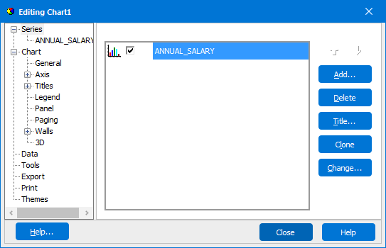
Here you can customize such as colors, axis labels, tick marks, plot colors, legend appearance, and chart title.