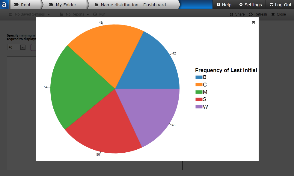
ChartingCharts in the Web Viewer are similar to charts in the Argos client, but have a somewhat different look and feel. We’ve focused on delivering charts that use industry best practices for data visualization, so some of the less-frequently-used options you’re used to seeing in the Argos client are not supported in the Web Viewer. The intention is to display attractive charts that make it easy for you to find the information you need, without any clutter from options that you don’t. Below is a sample pie chart in Web Viewer: |
|
|
|
|
Chart TypeOne of the most useful features of charts in Argos Web Viewer is that you can change the chart type on demand. When the mouse cursor is anywhere on the chart, two icons appear in the upper right corner. Clicking the bottom icon that looks like an eye brings up a dialog that allows you to choose the chart type:
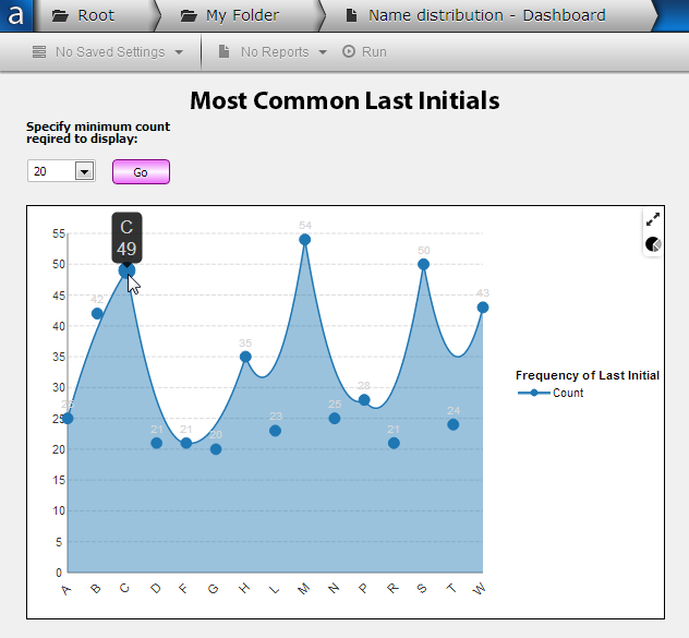
In this example, using an area chart (Bezier) makes it easy to see how many letters occur infrequently versus how many appear frequently, and to identify the higher values easily.
|
Click the |
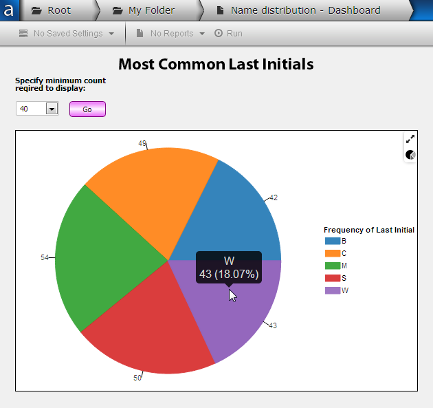
Fullscreen ViewClicking the arrow icon in the upper right hand corner of the chart brings up fullscreen view, which resizes the chart to take up the full window and dims the background.
Click the X in the upper right hand corner to return to the normal dashboard view. |
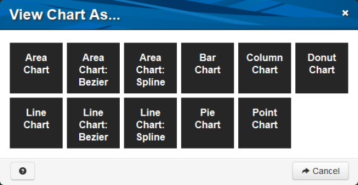
 icon to change the chart type.