OLAP
OLAP cubes in Web Viewer are similar to OLAP cubes in the Argos client, and perform much the same function. We’ve streamlined the user interface to make it easier to choose the dimensions to display. There are also some slight changes to the look and feel, and some of the advanced configuration options have been updated for ease of use.
When you first load a cube, you may see a predefined view of the data, if this is how the DataBlock designer created it.
Alternatively, if no default view exists you will see a blank cube waiting for you to select your measures and dimensions.
Viewing Data
Once the cube has been constructed, you can use the following buttons to sort, expand, or view graphical data.

|
Expand dimension. Only visible when there are additional sub-dimensions under a dimension. |

|
Sort by measure. |

|
View chart. |
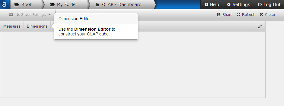
Dimensions
Click Dimensions to configure the cube. The Dimension Editor has lists of the available and displayed dimensions. You can click and drag each dimension into the Columns or Rows lists, or drag it back into the Available column to remove it from the cube.
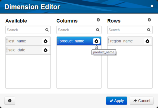
Click the gear icon to access advanced configuration for each dimension.
Measures
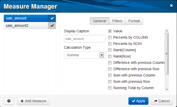
Measures are the sums, totals, or other calculations that display in the OLAP cube. They are the information you are looking for based on the dimensions. Click Measures to open the Measure Manager where you can define which measures appear in the cube and how they display. Use the Add Measure button to create customized additional measures.
OLAP Charts
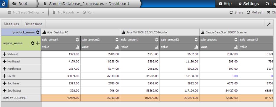
Clicking the chart icon at the top of any column in an OLAP cube brings up a graph of the data for that column. In the first example above, the columns in the OLAP cube show a list of sale amounts for each product. Clicking the chart icon next to the Asus VW266H 25.5" LCD Monitor brings up the following graph:
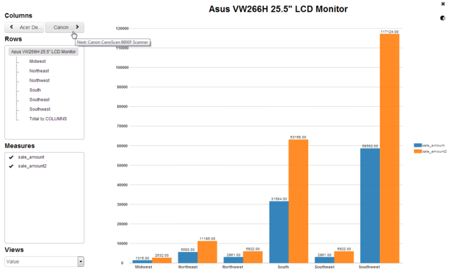
Chart Options
| Columns | Click the left or right arrows to see the graph for the previous or next column in the OLAP cube. |
| Rows | Select the row(s) you want included in the chart. |
| Measures | Select the measure(s) you want included in the chart. Each measure is a new chart series. |
| Views | When you configure your measures, you can include one or more views for the data in the OLAP cube. For example, you can interpret the data as a plain value; display percents by row or column; show the difference with previous rows or columns; etc. The Views drop down allows you to choose which of the enabled views to display in the chart. |
Chart Type
To change the chart type, click the  icon. You have a choice of bar, line, scatter, or pie charts.
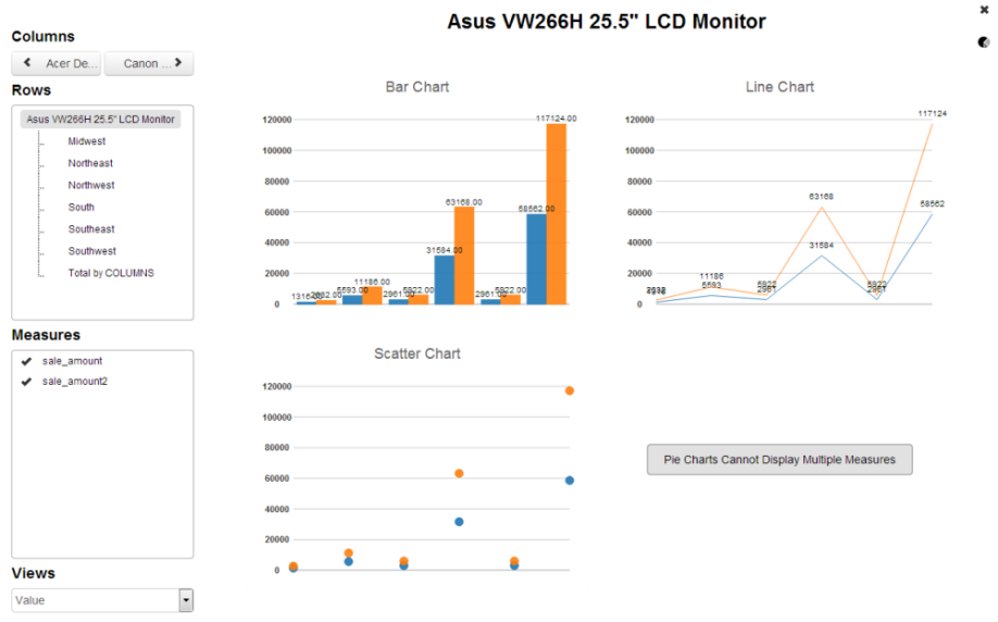
Note: If you select more than one measure, you will not be able to select a pie chart as this type of chart can only display one series at a time. To view a pie chart for a series, un-check the extra measures in the box on the left.